🔎 How to interpret the sensitivity analysis diagram
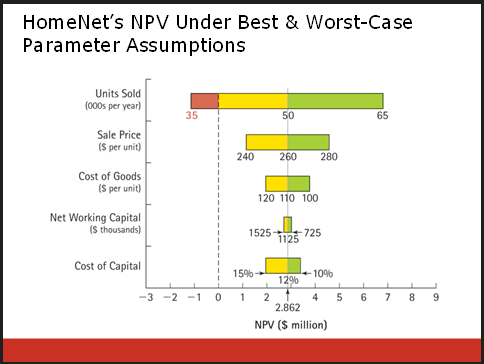
This is sensitivity analysis, so while there are many critical variables listed in the diagram, we are only looking at the impact of changing one of them at a time. For example, the top bar demonstrates how the NPV of the project will vary based on assumption about the number of Units Sold per year.
- The grey line indicates the most-likely or expected outcomes for each variable. If all of those happen simultaneously, the NPV will be .
- The Leftmost point says that for the worst case assumption on units sold are sold and the NPV of the entire project is approximately when we use the most-likely values for the other critical variables. To be concrete, this leftmost point is the estimate when we assume:
- 35,000 units sold per year ←pessimistic value
- a sales price of ← expected
- a Cost of Goods of ← expected
- NWC of ← expected
- Cost of Capital of . ← expected
- Holding each of the other critical variables to their most-likely values illustrates how only one critical variable is deviating at a time.
- It is indicated with red because it is less than the break-even point.
- The rightmost point shows the most optimistic estimate for Units Sold. It results in an NPV of approximately .